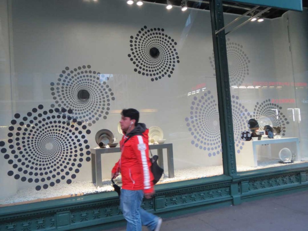
I deliberately left the storefront sign out of this photo in an effort to help the viewer maintain objectivity. Can you determine what product is sold here? High contrast graphics are artfully installed first on the storefront glass and then repeated on the white backdrop in first a lighter color and second a smaller scale, creating the previously discussed concept of visual cognition and leading the shopper to focus on the dinnerware. Not surprising then, that the store is Bed Bath and Beyond. Further, the street reflections are kept to a minimum by the awning. Adding a few pieces of colored dinnerware into the mix might have been an improvement, but the window is nevertheless simple and successful as is. In my experience it takes a true professional to practice the restraint necessary to implement such a sophisticated design.
