WELCOME TO
INSIGHTS: A DISCUSSION ABOUT “PUBLIC SPACE” DESIGN
Gaddis Architect specializes in all phases of commercial and commercial retail design, design management and construction. If maximizing the success of your business by optimizing the performance of your store, or commercial space design is a goal, then attending the following “Insights” could provide some very real benefits. Many common, and some not so common, design challenges are analyzed. Solutions aimed at increasing retail traffic, creating visual presence in various environments, and expressing not only a particular shopping experience but also the business’s brand, are presented. We think that all design is, on some level at least, retail design. Please scroll on, start a dialogue, contact us anytime.
Maximize Inherent Marketing Potential
While on the subject of sunglasses, maybe a look at the ubiquitous revolving floor display’s is in order. Let’s face it. If you are a drug store, convenience store, variety store, gift and card shop, hardware store, news stand, travel shop, grocery or any other kind of bodega you know all about these sunglasses display fixtures. They come in counter and floor models, doubles and singles; they are usually equipped with a couple of mirrors, graphic panels on top and sometimes back panels; mostly they display a bunch of merchandise in a small amount of space; the point being, it is rare to see a retailer take advantage of their inherent marketing potential.
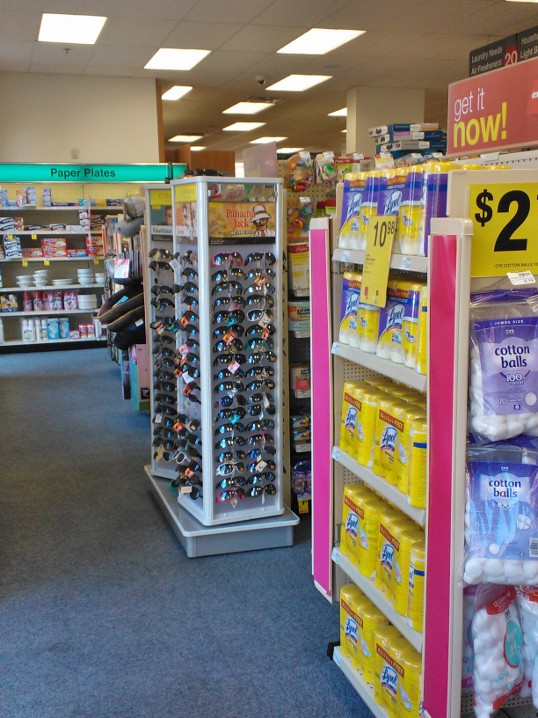
Different views of the same display.
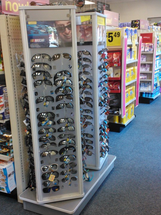
Different views of the same display.
The sunglasses display in the photos, courtesy of my cell phone in a well known and here un-named store, provides an example. From the location of the display in the store, it would appear that the markup on Lysol and cotton balls is as great as it is on sunglasses? Likewise, a customer might want a pair of sunglasses to change a diaper on the seat of a car parked at a Nascar event put on by Panama Jack. Not so funny when lost sales opportunities are taken into consideration.
If this type of sunglasses display is a must for your market, then why not maximize it’s best sales potential?
- Put the sunglasses display in a place where people wait. This allows try on time.
- Put them near related product, i.e. glasses cases and cleaners, sun screen, driving aids, etc.
- Put them near related fashion items, or in lieu of this, try near the fashion magazines.
- In sunny conditions where there is walking traffic think about a window display.
- Use the graphic space on the fixture to reinforce your marketing message. Change it when the display is moved.
- Or if you prefer not to change it often, use a general message that reinforces the store brand.
- Or if it is important in your market, use the graphic space for brand specific product information.
- Think about using an information panel that explains the differences between types of lenses.
- Make sure the fixture is functional, and the mirrors are clean.
- Keep it fully stocked with merchandise.
- Consider two smaller strategically placed displays instead of one big one.
While on the subject of sunglasses, maybe a look at the ubiquitous revolving floor display’s is in order. Let’s face it. If you are a drug store, convenience store, variety store, gift and card shop, hardware store, news stand, travel shop, grocery or any other kind of bodega you know all about these sunglasses display fixtures. They come in counter and floor models, doubles and singles; they are usually equipped with a couple of mirrors, graphic panels on top and sometimes back panels; mostly they display a bunch of merchandise in a small amount of space; the point being, it is rare to see a retailer take advantage of their inherent marketing potential.
The sunglasses display in the photos, courtesy of my cell phone in a well known and here un-named store, provides an example. From the location of the display in the store, it would appear that the markup on Lysol and cotton balls is as great as it is on sunglasses? Likewise, a customer might want a pair of sunglasses to change a diaper on the seat of a car parked at a Nascar event put on by Panama Jack. Not so funny when lost sales opportunities are taken into consideration.
The sunglasses display in the photos, courtesy of my cell phone in a well known and here un-named store, provides an example. From the location of the display in the store, it would appear that the markup on Lysol and cotton balls is as great as it is on sunglasses? Likewise, a customer might want a pair of sunglasses to change a diaper on the seat of a car parked at a Nascar event put on by Panama Jack. Not so funny when lost sales opportunities are taken into consideration.
Reaching the walk and drive by market.

Under Performing Storefront
Independent opticians and eyewear retailers often miss a marketing opportunity because they don’t know how to make a visual impact with their storefront. Glasses like jewelry and accessories fall into the small product category, i.e., anything smaller than a human head.
The chains hire expert designers to work out ways of showcasing tiny merchandise, much of it involving custom case work, luxurious materials and feature lighting. Others, give up on the storefront altogether, choosing instead to open the window completely to the sales area beyond. Still others, rely on prominent and message heavy signs, or brand specific imagery. There are a few who actually get how to incorporate actual merchandise into attention grabbing storefront displays that works with signage and related brands to deliver a super marketing message.
Smaller retailers offer great products and services, but without the store planning resources of larger chains how can they take full advantage of the high priced display space associated with their storefront?
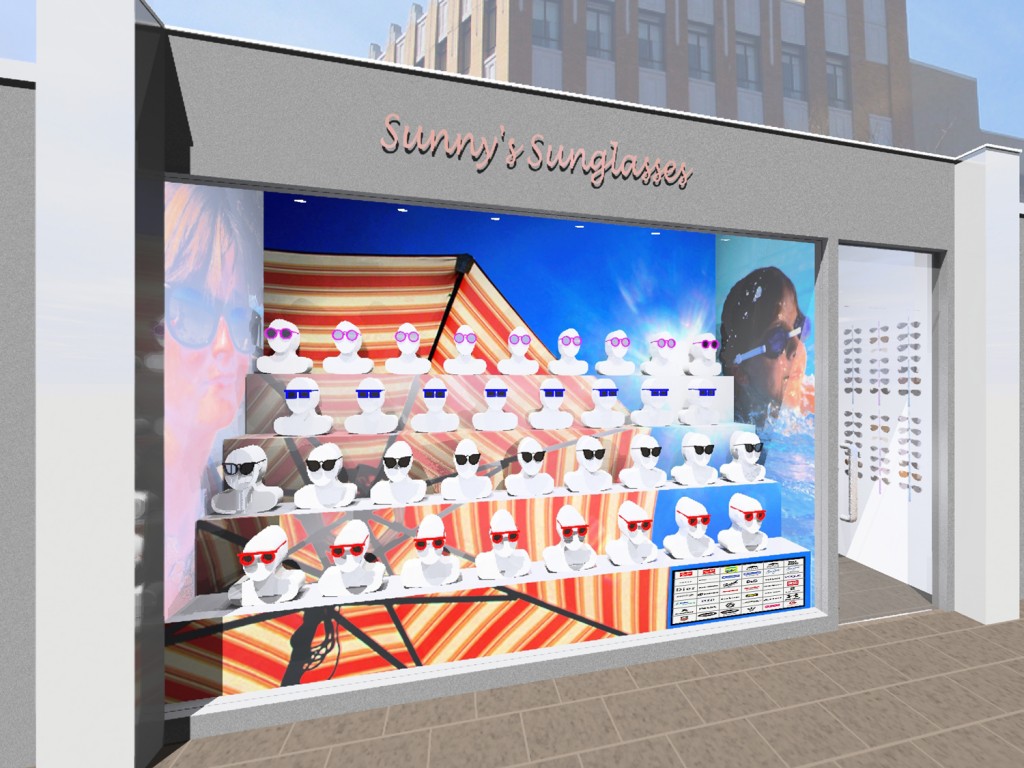
Storefront Design by Gaddis Architect, Copyright © 2012
In the image above and notes below I suggest some techniques that enable a retailer to reach both walking and drive by markets with a physically little product?
- Have a convertible shelving/platform system and good display lighting installed in your window.
- Display only one or two, preferably related, products at a time.
- Make the main display module human or human sized. Both full and partial mannequins work. Remember, people are attracted most to other people, and you only have about 5 seconds to get the shoppers attention.
- If not using mannequins, make it a display module that is close to human in size. Use primary forms, i.e., cylinders, boxes, pyramids.
- Repeat the product. When landscape designers want to make a statement in the view they use a lot of one thing.
- For drama and to stand out of the street-scape add a bold but generic graphic. High contrast always attracts visual attention. To much contrast is visual noise.
- Establish a hierarchy. Above, from smallest to largest, we see vendor logos, wall displays, mannequins dressed with glasses, over sized side wall photos, and finally the umbrella graphic, which is reinforced with an artist’s trick. The color becomes less saturated as it moves back, until full saturation re-appears as a bright back wall.
- Last, but really important, set up a marketing program for your window and test your displays in an offsite location.
Copyright © Bridget Gaddis 2012, all rights reserved.
Let the Chaos Happen?
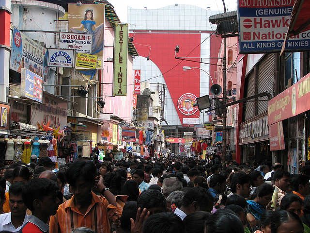
I have first hand experience shopping in districts like the one above. My reaction – temporary paralysis in the face of immense opportunity – is always the same. American City Planner, William Whyte famously observed that what attracts people most is other people, which leads me to ask, has he defined a universal retail design strategy? Is it the default blueprint for markets like this one in Chennai, and more importantly can designers improve this retail experience without destroying it? How?
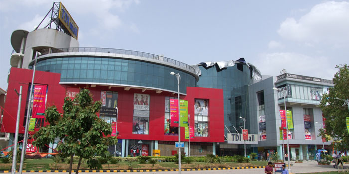
India’s answer to the western style shopping mall, touted as “international best practice” housed in local identity, is considered by many to be an improvement. Is it really, or does it rather encourage western style problems, not the least being lack of parking in an increasingly mobile country? All very big questions. Maybe the answer is to think small. If I were designing for a retailer in the Chennai people-scape, I might ponder the best way of functioning in, and formulating an identity from, my small piece of the chaos. The row of mannequins on the left starts to suggest potential.

