WELCOME TO
INSIGHTS: A DISCUSSION ABOUT “PUBLIC SPACE” DESIGN
Gaddis Architect specializes in all phases of commercial and commercial retail design, design management and construction. If maximizing the success of your business by optimizing the performance of your store, or commercial space design is a goal, then attending the following “Insights” could provide some very real benefits. Many common, and some not so common, design challenges are analyzed. Solutions aimed at increasing retail traffic, creating visual presence in various environments, and expressing not only a particular shopping experience but also the business’s brand, are presented. We think that all design is, on some level at least, retail design. Please scroll on, start a dialogue, contact us anytime.
Retail Architect: billboards used as a store design strategy
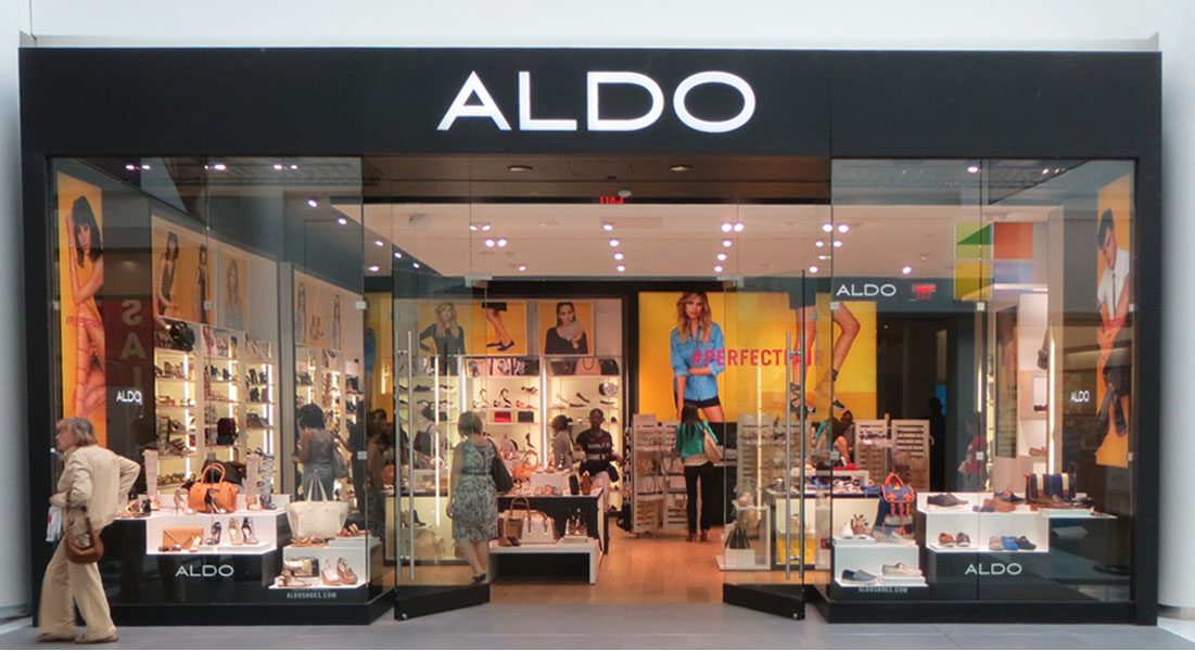
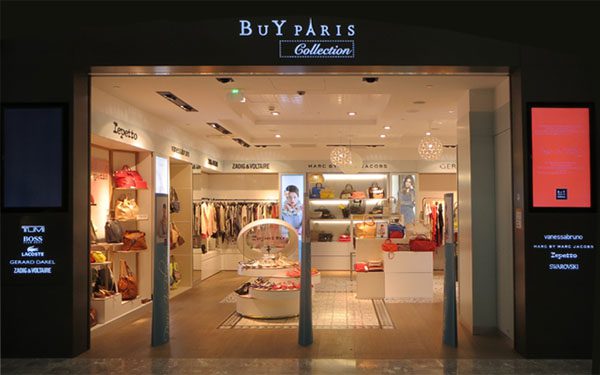
Recently I have looked at some design features that can make a store stand out, or differentiate, from its neighbors in the mall scape, leading to a design idea that I may, or may not, have mentioned previously; namely mall storefronts are being treated like billboards. Compare, for example, the type of merchandising that is going on in the Aldo store with that of the Buy Paris Collection below. On a practical level this may not be a very fair comparison as Aldo has rallied all of its substantial store planning resources around supporting and marketing their brand, while the shop in the Paris airport is marketing multiple brands, probably with considerably less resources. That said, this discussion is academic and I am using the contrast between the two shops to demonstrate a design technique.
Clearly, Aldo has used every inch of wall space to deliver a marketing message about their product. It is a message being delivered to virtually every potential shopper with a view of the store no matter where that shopper happens to be located. The desire to accomplish this is nothing new. The installation of billboard size images on every available inch of visible wall, on the other hand, is a fairly new trend. I expect it is only a matter of time before the message, actually creeps onto the ceiling, and I am sure examples of exactly this can easily be found.
By comparison, the Buy Paris Collection casts its marketing net into a much smaller visual pond simply by dint of scale. Certainly good design practice is employed. The high contrast between the white illuminated sign on the black background along with the brightly colored banner are attention grabbing features. The interior signage, illuminated graphics and nicely displayed merchandise all follow the store planning rules, leading me to ask; is one of these techniques more effective that the other?
The question is one of relevance. The retail environment, always competitive, is ever more so now. Pressured on one side by online competition and the other by indirect competitors for the attention of the same customer base, retailers are feeling compelled to enter the context of entertainment shopping. It is a fluid environment where relevance is everything.
Retail Architect: pattern, color and scale that delivers a marketing message
I took this photo of a new Bath & Body Works store in a recently renovated local mall because the project is instructive on several levels. First there is no doubt about who the retailer is. The name is perfectly highlighted on the front of the main entry fixture, again above the wall display, and of course on the storefront sign, there but not shown. Some landlords try to limit the number of times a retailer can repeat their logos in the line of vision. I find that, recently, this practice has been giving way in favor of more flexible design guidelines, possibly in response to tighter retail markets. Either way, repetition is good for the brand.
This project is about more that the name though. It is about delivering a marketing message, which is done here by the clever incorporation of text into the very context of the store. Let’s consider the context first. The checked wall covering is extremely busy and could have, in a different application, gone totally wrong. It is working here because the high contrast both attracts attention and supports the message in terms of scale. In fact, it functions as a connection between the blocks of small merchandise and the actual text messages which are all offset in large solid color fields. These solid color blocks show up as more that just backdrops for signage. They are used in the back of displays, as plain color coded markers used to define categories of merchandise, and even as fat text turned into color blocked display fixtures. The result is interesting and completely readable.
Retail Architect : perpetual student of store design.
Three design principles to focus attention into a store.
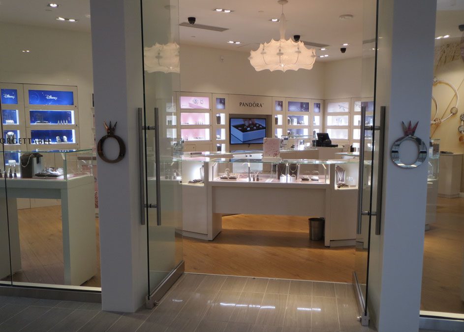
I took this photo in a newly renovated local mall because I thought that Pandora did a nice job of focusing attention into the store and onto the tiny merchandise. Any retailer faced with marketing very small products knows what a challenge this can be. Three principals come together to make the design effective. First, areas of high contrast jump out of an otherwise mid tone world. Think of the dark blue showcases on the left as the real shop entrance. Notice that if this is the visual entrance, then Disney is written on the door. Second, a progressively lighter version of the carefully placed pastel backdrops draw the shopper further into the space, until the brightest showcase is in the back. Third, the progression is further reinforced, this time in terms of scale. If the storefront is thought of as a single large display case then we see it divide into progressively smaller units as we move toward the perimeter of the store, effectively pointing until we find ourselves staring directly at the tiny products featured inside of the smallest showcase in the rear. Such a sophisticated approach is very difficult for even the most experienced designer to achieve, often happening more by good luck than planning. Planned or not, a retail architect will surely find several store design lessons to be learned here.


