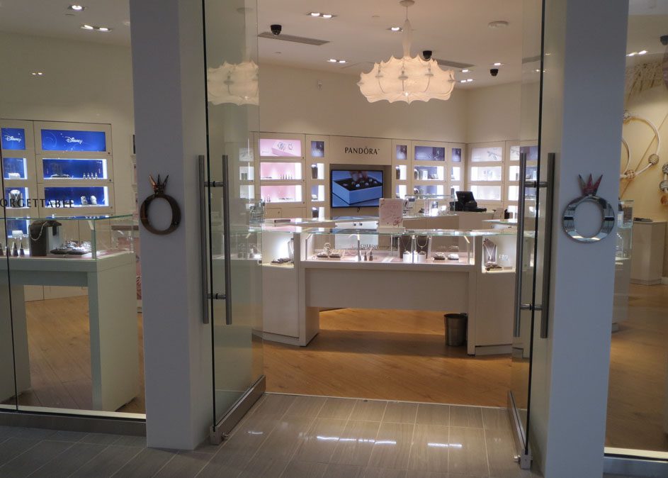
Three design principles to focus attention into a store.
I took this photo in a newly renovated local mall because I thought that Pandora did a nice job of focusing attention into the store and onto the tiny merchandise. Any retailer faced with marketing very small products knows what a challenge this can be. Three principals come together to make the design effective. First, areas of high contrast jump out of an otherwise mid tone world. Think of the dark blue showcases on the left as the real shop entrance. Notice that if this is the visual entrance, then Disney is written on the door. Second, a progressively lighter version of the carefully placed pastel backdrops draw the shopper further into the space, until the brightest showcase is in the back. Third, the progression is further reinforced, this time in terms of scale. If the storefront is thought of as a single large display case then we see it divide into progressively smaller units as we move toward the perimeter of the store, effectively pointing until we find ourselves staring directly at the tiny products featured inside of the smallest showcase in the rear. Such a sophisticated approach is very difficult for even the most experienced designer to achieve, often happening more by good luck than planning. Planned or not, a retail architect will surely find several store design lessons to be learned here.
