WELCOME TO
INSIGHTS: A DISCUSSION ABOUT “PUBLIC SPACE” DESIGN
Gaddis Architect specializes in all phases of commercial and commercial retail design, design management and construction. If maximizing the success of your business by optimizing the performance of your store, or commercial space design is a goal, then attending the following “Insights” could provide some very real benefits. Many common, and some not so common, design challenges are analyzed. Solutions aimed at increasing retail traffic, creating visual presence in various environments, and expressing not only a particular shopping experience but also the business’s brand, are presented. We think that all design is, on some level at least, retail design. Please scroll on, start a dialogue, contact us anytime.
Approaching After

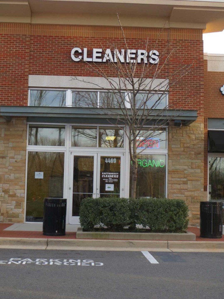
BEFORE

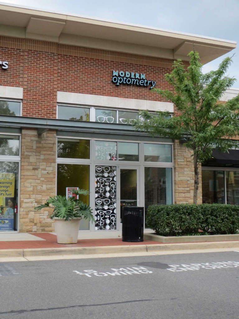
AFTER
- This is one of my projects in an almost finished condition. The storefront display is not yet in and there is still a blade sign and interior work to complete. In a few weeks you will find the completed project in the portfolio menu above.
- I have posted it because there is an important lesson here in time allocation. If you are a start-up retailer reading this post, ask yourself how long you think it took to go from the before photo to the after? Recently, I had an inquiry from a person opening their first specialty retail store. They had done a great deal of preliminary work. There was a business plan in place, financing, a connection with an important supplier, and even an up and running website complete with e-commerce. I am always surprised to see a new business this far into a project without understanding how much time is actually required to negotiate a lease and then design and build a real bricks and mortar store. I was unable to accommodate this fun and potentially successful project because the business owner contacted me in August intending to be open by Thanksgiving in time for the holiday season market.
- We started to design the project in the photo in November of 2012. There was a soft opening in August 2013 but the project was not actually complete with all graphics and displays installed until November 2013. I recommend that a new retailer start to design and plan their store a year in advance of their grand opening. This means that work on the business plan and the prototype store design should begin on the same day.
- So why does it take so long? The answer to this is really the subject of an additional post. It is not, though, normally the design time that delays a project. The most common delays have to do with choosing a location, lead times on products, and building permits.
Visual Synergy
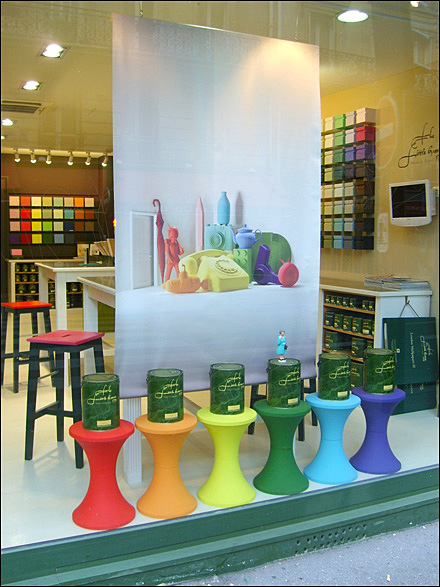
Wow! What a great example of what can be done with the most simple and inexpensive props. This photo, from a post by a fellow blogger about how it is easier to sell the idea of color rather than the idea of painting a wall, does a whole lot more than that. It does such a good job of attracting visual attention that even a guy living out of a suitcase might think about looking for something to decorate.
So, let’s consider what makes this work? Not only do the bold colored stools do a great job of counteracting visual noise on the glass, they are at a very recognizable “human” scale. Every one knows what the table in their living room looks like. Also the tables, size wise the biggest elements in the window, are repeated at a smaller scale in the colored boxes and paint samples in the background. These not only have the effect of drawing the passerby directly into the shop, but are also made more interesting because of the suggestive graphic used as a backdrop in the window. The synergy between the window display and the store interior is very successful in this project. The message is clearly that the interior of the store is as dynamic as the exterior. It is a message that is often overlooked by specialty retailers.
Simply Successful
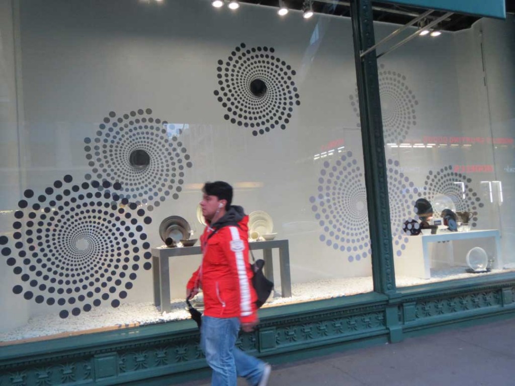
I deliberately left the storefront sign out of this photo in an effort to help the viewer maintain objectivity. Can you determine what product is sold here? High contrast graphics are artfully installed first on the storefront glass and then repeated on the white backdrop in first a lighter color and second a smaller scale, creating the previously discussed concept of visual cognition and leading the shopper to focus on the dinnerware. Not surprising then, that the store is Bed Bath and Beyond. Further, the street reflections are kept to a minimum by the awning. Adding a few pieces of colored dinnerware into the mix might have been an improvement, but the window is nevertheless simple and successful as is. In my experience it takes a true professional to practice the restraint necessary to implement such a sophisticated design.


