WELCOME TO
INSIGHTS: A DISCUSSION ABOUT “PUBLIC SPACE” DESIGN
Gaddis Architect specializes in all phases of commercial and commercial retail design, design management and construction. If maximizing the success of your business by optimizing the performance of your store, or commercial space design is a goal, then attending the following “Insights” could provide some very real benefits. Many common, and some not so common, design challenges are analyzed. Solutions aimed at increasing retail traffic, creating visual presence in various environments, and expressing not only a particular shopping experience but also the business’s brand, are presented. We think that all design is, on some level at least, retail design. Please scroll on, start a dialogue, contact us anytime.
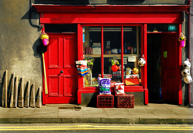
No question of differentiation here.

Macroom shop, between Killarney and Cork City, is typical of small grocery type shops, until recently, common in Ireland.
Last week was Northern Virgina “Retail Week.” I attended several presentations by Marc Wilson, retail expert and consultant to the Virginia Small Business Development Center. A page entitled, “Differentiate the Business” appeared in all three of the events I attended. This can be accomplished by showing how a retailer meets all or some of these criteria:
Answering sets the business owner on the path to the well known “30 second elevator pitch” eventually enabling him to come up with the all important tag line, i.e., Don’t leave home without it. This advice, totally relevant for the business end of a small retailer, also informs the physical elements, consider the speeding Nike logo. Taking this one step further ends up with a store designed to support the retailer’s image and promote the most possible sales. Working out the all important tagline, whether it is actually used or not, may be more difficult than figuring out what it should look like. This rustic little shop found its muse in a can of red paint, thereby outlasting its competition in a shrinking market. No question of differentiation here.
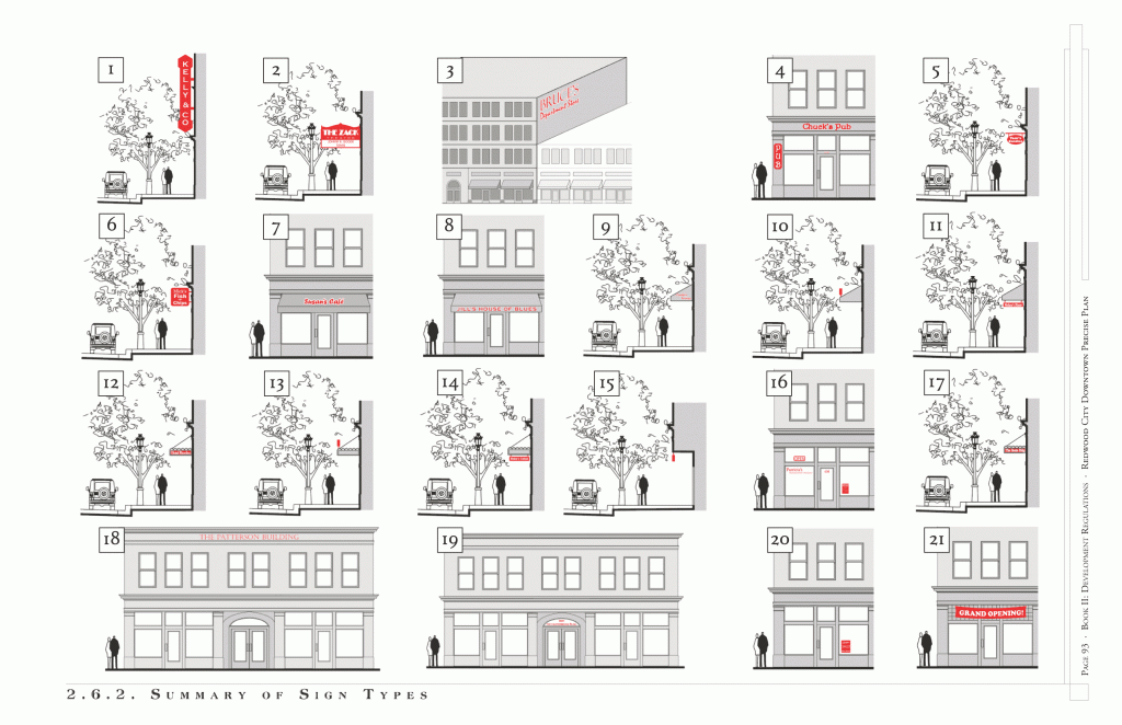
21 Common Storefront Sign Types
This little article is a really good reference for any one diving into the pond of storefront signage. Follow the link to see complete definitions: Ped Shed » A Typology of Signage.
Signs of Notoriety
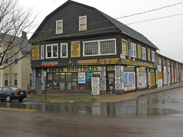
It is safe to say that both of these stores are notorious, albeit for different reasons. I challenge anyone to find more opposite store types. One of them is compliant with the local sign code and one is not. Any experienced store planner will quickly point out which is which without even looking at the local code. But what about a retailer without such experience. Navigating the local sign code can be a daunting and time consuming task, especially for a business opening on a budget. One way to begin is to understanding the local “signage environment.”

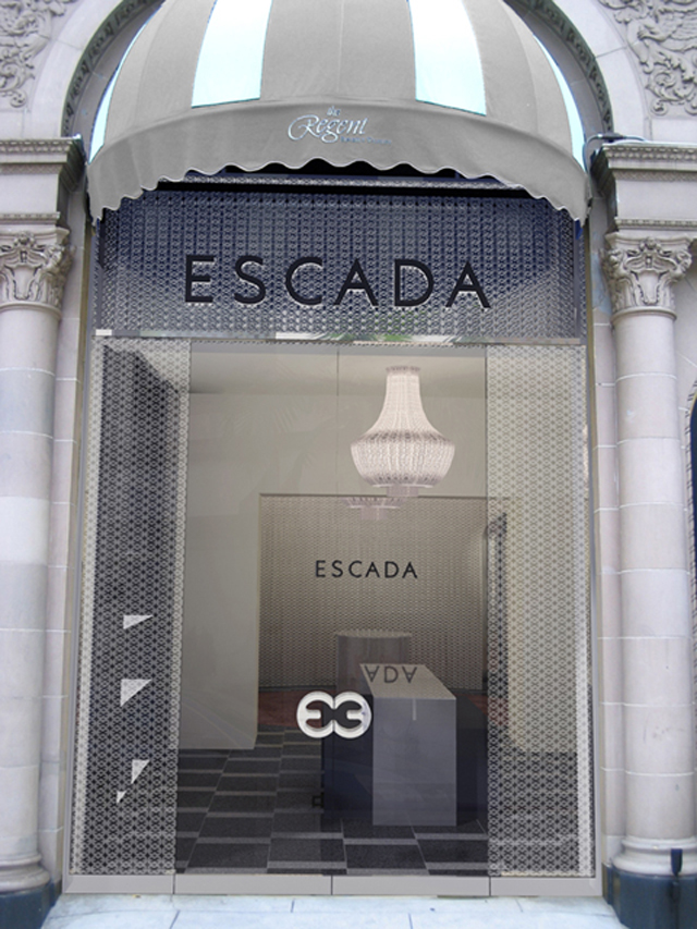
Escada, Beverly Wilshire Hotel, 2006
Affluent neighborhoods always have detailed regulations covering the size, shape, and allowable types of signage in their districts. Many have a design review process as well. In 2006 this proposed new storefront design for the Escada store in the Beverly Wilshire Hotel – Yes it is the same one that was in the movie Pretty Woman – went before the Beverly Hills Design Review Commission and failed. The textured glass, created by applying a semi transparent film with the Escada logo (same as the door pulls) repeated over and over to form a pattern, was deemed signage by the local “design police” and disallowed. Eventually the film was removed and the design allowed.
On the other hand, local authorities in this Pennsylvania town seem to have no problem at all with the Arcus Brothers signage. The place has been there for years and is the prototype for “buyer beware” which adds to its appeal. It would appear that any attention is better than none, so the sign program is allowed.


