
WELCOME TO
INSIGHTS: A DISCUSSION ABOUT “PUBLIC SPACE” DESIGN
Gaddis Architect specializes in all phases of commercial and commercial retail design, design management and construction. If maximizing the success of your business by optimizing the performance of your store, or commercial space design is a goal, then attending the following “Insights” could provide some very real benefits. Many common, and some not so common, design challenges are analyzed. Solutions aimed at increasing retail traffic, creating visual presence in various environments, and expressing not only a particular shopping experience but also the business’s brand, are presented. We think that all design is, on some level at least, retail design. Please scroll on, start a dialogue, contact us anytime.
To Mall or Un-Mall?
-
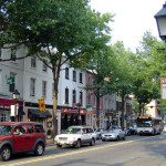
- Old Town Alexandria, VA
-
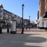
- Crocker Park Shopping Center, Westlake, OH
For some time I have wanted to compare a real town shopping district to one of the fakes that are popping up around the country. We humans have this acute sense of the authentic, leading me to ask, is it really possible to copy the “new urbanist” vibe? Is “un-malling” the malls really working out? Do the slick brand specific storefronts look any different inside an enclosed mall than they do on a city street, fake or not? These questions stumps social intellects and planners alike. As an architect I do not presume an opinion except to say that, all retailers must fight for their piece of an often saturated market. A well defined visual impact in a perpetually evolving retail environment, be it mall or un-mall, can mean the difference between success and failure.
From Static Design to Dynamic Update

Before
Theatrics in display merchandising can be very effective if applied in moderation and arranged for maximum impact. So what has gone so wrong?
- Red and black plays to the idea of drama, but here it is overwhelming. Students often fall into the trap of designing according to emotional ideas instead of dispassionate analysis.
- The merchandise is relegated to bits of white and must compete with reflections from the mall concourse above.
- The glossy black stone has some reflective properties but it is not used to any advantage. The red is dark, and absorbs light, limiting the sparkle to a viewers direct line of vision and all but eliminating secondary reflections.
- The white floor and light mall concourse surrounding force the red and black store to merge into a single static mass.
- The entire composition ends up looking like a dark dinner plate on a light table. The silver disappears.

After
In the new prototype here the Swarovski design team has manage an amazing correction. They have grabbed the attention of passing shoppers and claimed their place in the mall-scape with, quite literally, a tiny product. What works?
- The rule of contrast has been bravely broken, i.e. attention may be drawn to an object by surrounding it with a bigger contrasting object. Actually, it was not so brave, considering the hard lesson learned from the old store.
- merchandise light boxes, varying light levels and especially the “white box” are the means, by dint of their reflective properties, of exponentially increasing the visual impact of the store.
- Add sparkling merchandise ganged for affect, shinny surfaces including the faux crystal sign band and lit logo; now reflections of secondary color set the space in motion.
- By happy accident, the white line of mall tile extends the storefront in both direction, encouraging the shopper to follow the path directly to the store.
- Such a visually stimulating environment is dynamic enough to captivate even the most preoccupied shopper.
- Like a carnival in the cityscape, a passerby wants to see what is going on.
“Cafe Incognito”


New shop owners, even those who are very successful, would do themselves a favor by looking at pictures of their storefronts taken from several directions. When this recently opened cafe is put to such a photo test, it becomes immediately apparent that a better name for the place might have been cafe incognito, which goes a long way toward explaining what appears to be a disappointing performance. If this cafe was my client, an idea I fancy, I would tell them:
- Your entry is invisible and customers like to see the door.
- The tall shrubs are completely blocking the view into the patio. Do whatever it takes to get them removed.
- Your store faces North, meaning it is always in shadow. This can be nice from the inside, from the outside not so much. Find a way to brighten the exterior.
- Change the awning graphic, i.e., color and pattern. If the landlord objects tell them that it is necessary in order to distinguish yourself from the grocery, and the profile alone should be enough to hold its place in the overall composition of the building.
- Make your sign as big as the code will allow, and if you are not allowed to make it bigger try to repeat it in every bay.
- Consider a banner that would be visible to a customer approaching from the South.
- Consider trading the flower beds on the West side for flower boxes. Also a table & umbrella is probably better for business than a magnolia.
- A passageway has been created by the table arrangement on the patio instead of a place. You want people to come in and sit down, but you have created an aisle leading to other vendors.
- Put a sign stand on the patio with your menu and seating options.
- Use the patio to attract night time customers. Put candles or lanterns on the tables. Vary the light level and color to create sparkle and drama.
- Once the shrubs are removed re-think the interior and patio lighting.
- The night time peek shows a bight and lively interior being missed by potential customers.