
WELCOME TO
INSIGHTS: A DISCUSSION ABOUT “PUBLIC SPACE” DESIGN
Gaddis Architect specializes in all phases of commercial and commercial retail design, design management and construction. If maximizing the success of your business by optimizing the performance of your store, or commercial space design is a goal, then attending the following “Insights” could provide some very real benefits. Many common, and some not so common, design challenges are analyzed. Solutions aimed at increasing retail traffic, creating visual presence in various environments, and expressing not only a particular shopping experience but also the business’s brand, are presented. We think that all design is, on some level at least, retail design. Please scroll on, start a dialogue, contact us anytime.
Store Design: Material Perceptions
I was researching another project when I ran across these book stores. I was looking for examples of how different finish materials can change the perception of quality in a space, and as these views are void of brand signs, they allow for a fairly objective comparison on a store planning level as well. The examples were good enough to turn into an article as follows:
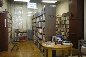
Store 1
Store 1 – This first store reminds me of Strand Bookstore in New York City, locally famous for used books, which should not come as a surprise as the plastic on the windows, mismatched fixtures, cheap but effective fluorescent lighting and existing brick walls and wood floors all suggest, not only extreme economy, but also sustainability. The chairs and wide aisles suggest a comfortable and possibly entertaining shopping experience. In NYC this equals “shabby chic.” Anywhere else it risks being just shabby.
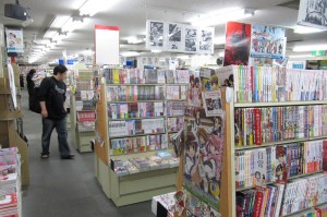
Store 2
Store 2 – The actual fixtures used in this store, likely high quality painted wood, display the merchandise for maximum advantage and provide storage as well. Nevertheless, carpet and acoustic tile floors and ceilings are strictly utilitarian, as is the lighting, which is adequate but stylistically dated as it is used here. The monotone, high foot candle light level removes the possibility of any particular focus or feature areas, as does the “many evenly spaced rows” type of layout. This ambiance is all about volume and possibly crosses over to discount.
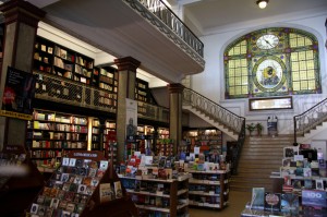
Store 3
Store 3 – This appears to be a high profile, historic, urban environment that is possibly a destination unto itself. Efforts have been made to help the store fixtures disappear into the location. Wood shelving and display tables match existing architectural trim and carefully placed invisible light sources outline perimeter merchandise walls artfully tucked under the balcony. Like dancers in a grand ballroom, table top displays nicely present the merchandise to main floor shoppers. A polite, public mood prevails.
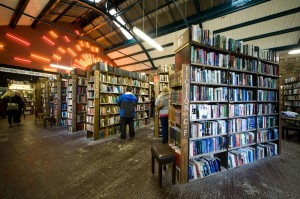
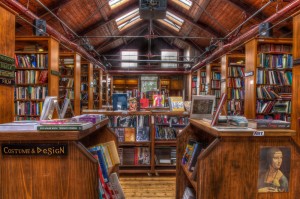
Store 4
Store 4 – This is another example of how existing buildings can drive the retail ambiance of a space. Exposed structure, skylights, stone walls, and distressed concrete floors identify an industrial loft type environment made relevant by the addition of colorful art lights, and a bit of modern ceiling material. Tall store fixtures made of construction grade wood emphasize the soaring ceiling height and merge into the prevailing aesthetic. One might be surprised to find that this trendy store, like store 1, is also selling used books.
Store 5
Store 5 – Perhaps the most unique of the stores, this is defined first by the the top to bottom wood finishes and then by the contemporary parkitecture, including the shelving units carefully incorporated therin. Visions of everything from Hoss Cartwright’s Ponderosa to Bilbo Baggin’s Hobbit Hole are conjured. The place practically invites the shopper to enter a mysterious world of fantasy.

Store 6
Store 6 – Finally we have the shop of no finishes, except of course the books, representing the weighty world of gold bound illuminated manuscripts and classic volumes read and reread over time in days when they had more than just historic value. This is the revered library showing up in Patrick Rothfuss’, The Name of the Wind.
Finally, it is of interest that, in spite of differing book sizes, the shelf heights have been maintained to form continuous horizontally aligned rows of books in all of these stores.
All photos on this site belong to the author, are used under Creative Commons or with permission from the photographer. The source may normally be found by following the link attached to the photo.
Store Design: When location is not enough?
 Slow Sales:
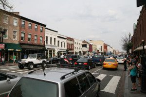
Recently I have had the experience of interacting with several long time business owners with shops in high traffic, high profile, historic locations. These are highly desirable locations with low vacancy rates and instances of failure. Not only is there high pedestrian and auto traffic, there is considerable tourist traffic as well. Yet some of these retailers lament decreased sales and blame a slow or no recovery from the economic slow down of 2008. Certainly such a conclusion might be true in economically hard hit parts of the country, but the answer may not be so simple in more affluent shopping districts. It is quite possible that there may be something else at the root of slow sales.
 Rooting out the Root:
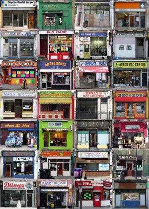
Faced with such a problem I would expect an experienced retailer to turn first to their marketing plan. Longtime retail business owners who have a history of success in a particular location often have a strong customer base and connections to the local community, via social and other media as well as web based technologies. Assuming for the sake of this discussion that marketing goals are being met in this regard with still disappointing sales results, then it might be time for the business owner to take a careful look up and down the street. If their storefront looks tired like those in the collage, it may be time for a change. Complacency can undermine even the most successful business, and those with long histories in a location are particularly vulnerable. Not only is there a tendency to feel that what has worked in the past will continue to work going forward, but even to reason that changing the way a shop appears might destroy it visual appeal. This is a dangerous way of thinking that can lead to irrelevance and decreased sales.
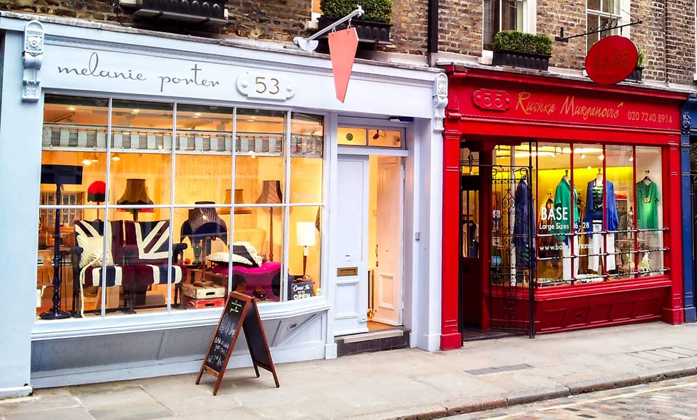
Remodel the Store, Refresh the Brand:
A store remodel can be one of the most effective ways for a retail business to attract new customers. It is especially effective when carefully coordinated with the marketing plan and designed to support a retailers brand.
Store Design: Exploring the “Unbrand”
If you are a sometimes visitor to this site you may have seen me ponder the impacts of “unbrand” in previous posts. With this recent article on “AdNews” I find myself again bestirred on the subject. The gist of the article is that “Unbrand” is a “Movement” initiated by Gen. C (connected) values, resulting in a shift in market focus from the designer to the designee. When considered in the context of the currently “logocentric” shopping place this shift could, in the design sense, prove to be profound. In short, how does/will/should an “unbrand” look? The temptation to present the obvious was too strong, leading me to alter the photo above to match the idea. Of course, no one has actually come to me and said, “I am opening a new store. I will be selling shoes. The store does not have a name. Please design the prototype.” That does not, though, stop me from trying to envision such a shopping experience.


Or maybe stores should rely on large format graphics and photos with generic labels to identify their products. It is, after all, how it is done on http://etsy.com. Either way, there are no answers here, just explorations. You will find the article here: AdNews: THE ADNEWS NGEN BLOG: The challenge of ‘Unbrand’.