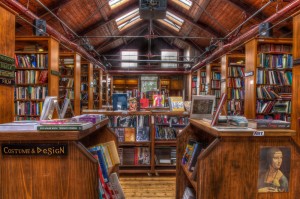
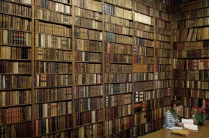
I was researching another project when I ran across these book stores. I was looking for examples of how different finish materials can change the perception of quality in a space, and as these views are void of brand signs, they allow for a fairly objective comparison on a store planning level as well. The examples were good enough to turn into an article as follows:
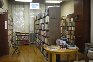
Store 1 – This first store reminds me of Strand Bookstore in New York City, locally famous for used books, which should not come as a surprise as the plastic on the windows, mismatched fixtures, cheap but effective fluorescent lighting and existing brick walls and wood floors all suggest, not only extreme economy, but also sustainability. The chairs and wide aisles suggest a comfortable and possibly entertaining shopping experience. In NYC this equals “shabby chic.” Anywhere else it risks being just shabby.
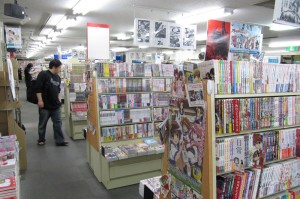
Store 2 – The actual fixtures used in this store, likely high quality painted wood, display the merchandise for maximum advantage and provide storage as well. Nevertheless, carpet and acoustic tile floors and ceilings are strictly utilitarian, as is the lighting, which is adequate but stylistically dated as it is used here. The monotone, high foot candle light level removes the possibility of any particular focus or feature areas, as does the “many evenly spaced rows” type of layout. This ambiance is all about volume and possibly crosses over to discount.
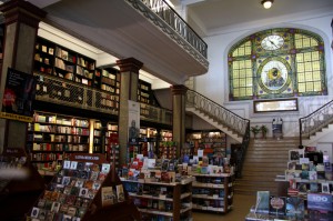
Store 3 – This appears to be a high profile, historic, urban environment that is possibly a destination unto itself. Efforts have been made to help the store fixtures disappear into the location. Wood shelving and display tables match existing architectural trim and carefully placed invisible light sources outline perimeter merchandise walls artfully tucked under the balcony. Like dancers in a grand ballroom, table top displays nicely present the merchandise to main floor shoppers. A polite, public mood prevails.
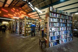
Store 4 – This is another example of how existing buildings can drive the retail ambiance of a space. Exposed structure, skylights, stone walls, and distressed concrete floors identify an industrial loft type environment made relevant by the addition of colorful art lights, and a bit of modern ceiling material. Tall store fixtures made of construction grade wood emphasize the soaring ceiling height and merge into the prevailing aesthetic. One might be surprised to find that this trendy store, like store 1, is also selling used books.
Store 5 – Perhaps the most unique of the stores, this is defined first by the the top to bottom wood finishes and then by the contemporary parkitecture, including the shelving units carefully incorporated therin. Visions of everything from Hoss Cartwright’s Ponderosa to Bilbo Baggin’s Hobbit Hole are conjured. The place practically invites the shopper to enter a mysterious world of fantasy.
Store 6 – Finally we have the shop of no finishes, except of course the books, representing the weighty world of gold bound illuminated manuscripts and classic volumes read and reread over time in days when they had more than just historic value. This is the revered library showing up in Patrick Rothfuss’, The Name of the Wind.
Finally, it is of interest that, in spite of differing book sizes, the shelf heights have been maintained to form continuous horizontally aligned rows of books in all of these stores.
All photos on this site belong to the author, are used under Creative Commons or with permission from the photographer. The source may normally be found by following the link attached to the photo.

