
WELCOME TO
INSIGHTS: A DISCUSSION ABOUT “PUBLIC SPACE” DESIGN
Gaddis Architect specializes in all phases of commercial and commercial retail design, design management and construction. If maximizing the success of your business by optimizing the performance of your store, or commercial space design is a goal, then attending the following “Insights” could provide some very real benefits. Many common, and some not so common, design challenges are analyzed. Solutions aimed at increasing retail traffic, creating visual presence in various environments, and expressing not only a particular shopping experience but also the business’s brand, are presented. We think that all design is, on some level at least, retail design. Please scroll on, start a dialogue, contact us anytime.
Set up for a risky comparison.


I almost feel guilty posting this, but not enough. The most obvious lessons can be the most difficult to learn. This is a bridal shop. To me the merchandise is more than just dresses. Each one of these is a work of art appealing on too many levels to discuss in one little blog post. What would motivate a shop owner to do the one thing that has the ability to detract from this beautiful merchandise, and worse yet, put in the shop window for all to see. How many clients will be drawn into this shop because the lace dress on display matches the curtain’s hanging from a rod in the back of the window.
There are many simple backdrops available for use in this type of environment. Anything from a photo realistic banner to a built display to simply a seasonally plain colored silk curtain would work really well. In fact, nothing at all, except a view into the shop, would be better than risking the comparison that is set up here.
Tips for good retail lighting.
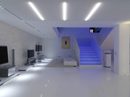
Phillips: Retail Lighting for Stores
Occasionally I run across well put information that is worth referencing here. Such is the case with this article on retail lighting. Thanks to Zumtobel for the research. Click the link to see the entire article, including more photos. To give an idea of what is covered, I have summarized 8 recommendations as follows:
- High contrasts is better than brightness.
- Use diffuse general lighting with accent lighting on displays and vertical lighting to delimit the periphery.
- Warm white lights extend the amount of time a customer spends in store.
- Vary the color temperature.
- Adapt the lighting to the target customer.
- Daylight and accent light is best for shop windows.
- Light the lower shelves.
- Use a combination of accent and back lighting for merchandise identification.
Effective store design should yield visually prominent merchandise.
I was asked by a potential client to look at this store, as she was in negotiations to take over the lease. The client was enamored of the ambiance created by the fixtures and furnishings. She brought a fist full of photos to our meeting, showing furniture and artwork in a similar style. She wanted to see how I would work these into the space and in particular the store window. When I asked for some photos or examples of merchandise, which in this case happen to be a line of specialty glassware and fine china, she did not have a single item to show me.
To an experienced retailer this story alone, without the necessity of looking at a single picture, would be enough to send up a red flag. How is it possible to sell a piece of art when the main visual focus is put on its frame? The customer won’t know if they are in a frame shop or gallery, which is a good part of why the shop in the photos was closing. Here are some things to consider in this situation:


Problem Areas
- The large overall view is the first place a customer starts to shop a store upon entering. In this store, clearly the high contrast between the black display units and the periwinkle blue walls is the main feature. This would work great in a casework showroom.
- The chandelier does a good job of drawing attention to a feature area but the merchandise is arranged so as to be almost incidental to the table and area rug.
- The check out counter is presented as a pretty piece of furniture and the company logo is just wall art to anyone not familiar with the brand, which for a start up is almost everyone.
- The merchandise being sold is difficult to define. We must work to see where the ladies’ end and the men’s begin, and it is possible that even children’s garments are sold.
- There seems to be jewelry and accessories lined up independently on glass shelves. These small items must compete with the heavy cabinets that frames them.
- There is a disconnect between the casual maybe even outdoor style of clothing being sold and the formal residential looking store design, which in this case, may even make the merchandise look cheap.
Ways to Improve Things
- Hire a professional to help you.
- Let your merchandise define the concept for the store, not the other way around.
- Change the millwork to a neutral color and don’t worry about loosing the periwinkle blue walls and two tone crown modling. Use tones that are closer together in light levels to reduce the contrast between the millwork and the walls.
- Don’t be afraid to remove the crown molding from the casework and install a few large lifestyle graphics on the wall in the back of the cabinets. Be sure to choose an image that reinforces the merchandise.
- Feature high profile merchandise in a carefully planned display directly underneath the chandelier. Use the table and rug elsewhere in the store for a table top display piled high with merchandise.
- It is fine to use a company logo to define a cash wrap, separate one department from another, or provide relief from a wall of merchandise. If you are a start up, and often even if you have been at if for a while, print your store name or brand somewhere on the logo.
- Work out ways to make departments appear different, but stay within your overall store concept.
- Effectively displaying small items like jewelry and accessories, often requires special fixtures and case pieces. In lieu of these, use these items in vignettes and put a lot in one place.