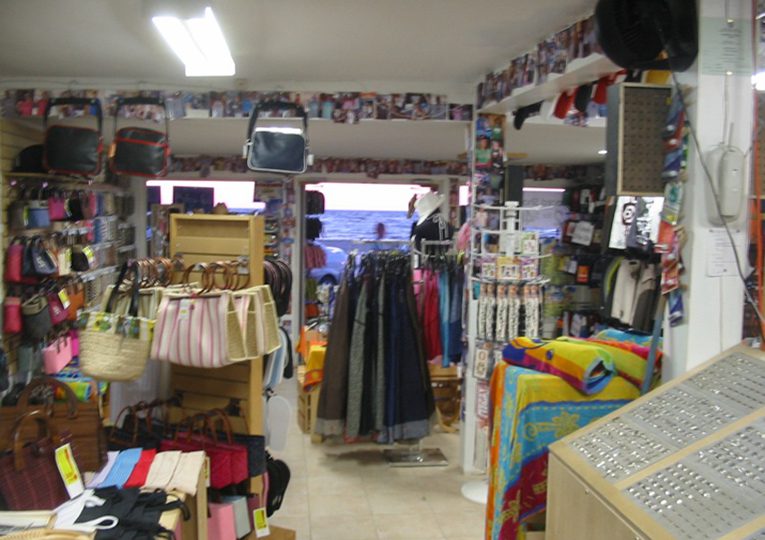
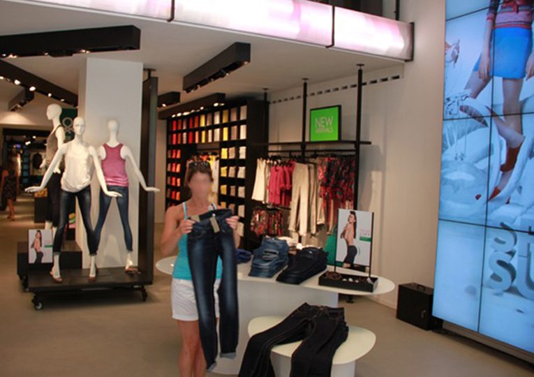
As a retailer, the last thing one wants is for their merchandise to be associated with the terms like worthless, disposable, or tacky. Yet, if it looks like tchotchke because of the manner in which it is presented, that is exactly what is communicated.
The primary remedy for the tchotchke effect is to recognize that the problem exists in the first place. I have seen business savvy start ups and experienced retailers alike end up with stores resembling tourist traps. The effect has many causes. Things like high inventory levels, lack of storage, and mixed product lines are physical issues that, in my experience, are easy to fix. Psychological blocks, though, resulting in denial, can undermine store performance. Causes aside, if the symptoms are not completely evident from the photo above, here are a few main ones: over crowded merchandise, no departmental definition, no visual focus, mixed and non matching store fixtures, cheap lighting, exposed equipment… the list goes on.
Restraint is the operative word when it comes to avoiding the tchotchke effect. After that, there a few visual rules that work.
1. Create a design concept.
2. Use only store fixtures that stick to the concept.
4. Place key merchandise at eye level.
3. Vary the scale.
4. Leave some empty space.
5. Create a feature.
6. Repeat in an organized way.
7. Color coordinate.
8. Use props and graphics to visually reinforce your product.


