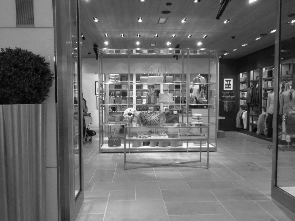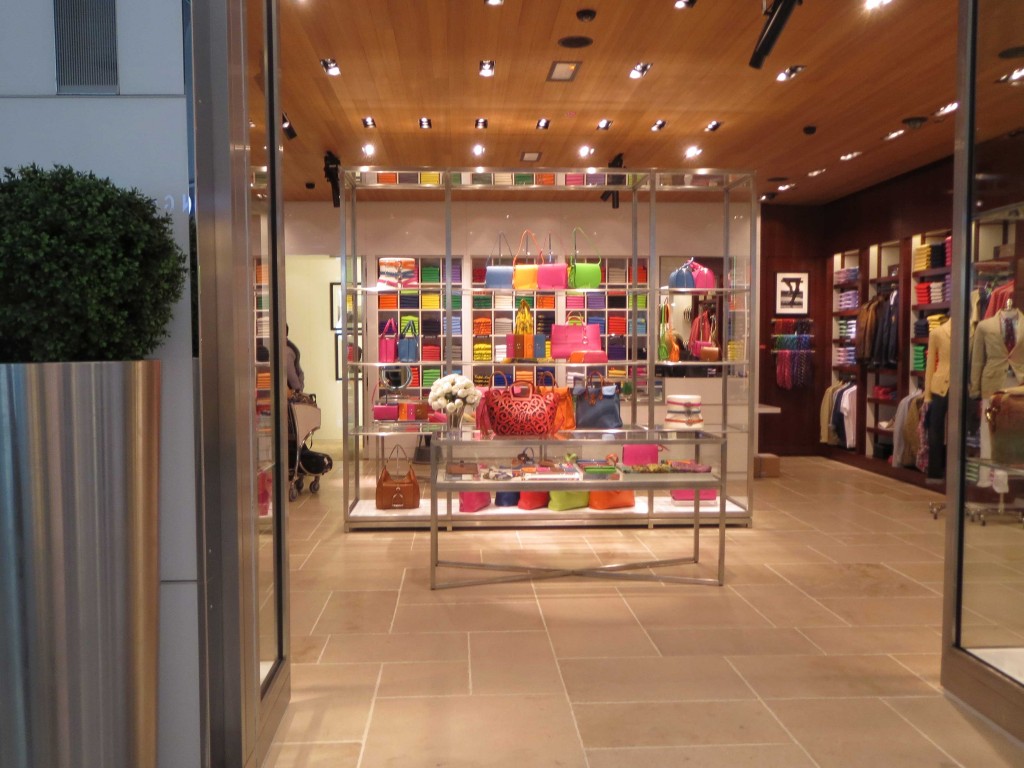
This is an instructive exercise on two levels. First lets consider the impact of merchandise placement in the black and white photo. It is quickly apparent that the main show, directly in the line of view as a customer enters or passes by the store, is an indecipherable patch work which says little about the products being sold. Also, there is actually some secondary “visual cognition”going on as our eye looks for clarity and finds it in the higher contrast which appears on the side walls where individual items or groups of items have been carefully framed by the surrounding architecture. This can be an effective technique when used in the right location; nevertheless assigning center stage to a confusion of merchandise is risky and could easily send customers searching for more understandable views in an adjacent store.
There is more to this particular story though as the second lesson is about what happens when highly saturated color is added to the mix. Suddenly what was a wall of confused merchandise becomes a high visibility focal point standing out in and being framed framed by the mid-tone world. Now the wall of merchandise has attracted attention sufficient to cross over the line of confusion and land squarely on the side of interest. Very interesting indeed.

