WELCOME TO
INSIGHTS: A DISCUSSION ABOUT “PUBLIC SPACE” DESIGN
Gaddis Architect specializes in all phases of commercial and commercial retail design, design management and construction. If maximizing the success of your business by optimizing the performance of your store, or commercial space design is a goal, then attending the following “Insights” could provide some very real benefits. Many common, and some not so common, design challenges are analyzed. Solutions aimed at increasing retail traffic, creating visual presence in various environments, and expressing not only a particular shopping experience but also the business’s brand, are presented. We think that all design is, on some level at least, retail design. Please scroll on, start a dialogue, contact us anytime.
Avoiding the Tchotchke Effect.
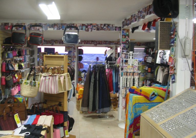
As a retailer, the last thing one wants is for their merchandise to be associated with the terms like worthless, disposable, or tacky. Yet, if it looks like tchotchke because of the manner in which it is presented, that is exactly what is communicated.
The primary remedy for the tchotchke effect is to recognize that the problem exists in the first place. I have seen business savvy start ups and experienced retailers alike end up with stores resembling tourist traps. The effect has many causes. Things like high inventory levels, lack of storage, and mixed product lines are physical issues that, in my experience, are easy to fix. Psychological blocks, though, resulting in denial, can undermine store performance. Causes aside, if the symptoms are not completely evident from the photo above, here are a few main ones: over crowded merchandise, no departmental definition, no visual focus, mixed and non matching store fixtures, cheap lighting, exposed equipment… the list goes on.
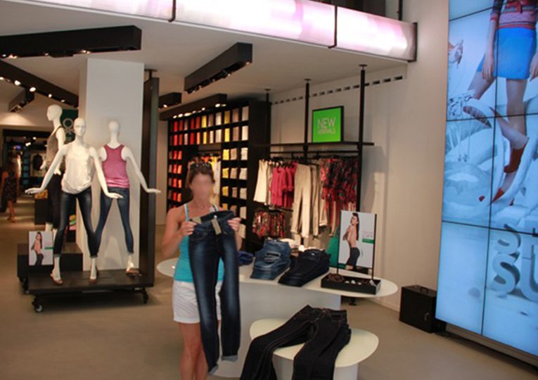
Restraint is the operative word when it comes to avoiding the tchotchke effect. After that, there a few visual rules that work.
1. Create a design concept.
2. Use only store fixtures that stick to the concept.
4. Place key merchandise at eye level.
3. Vary the scale.
4. Leave some empty space.
5. Create a feature.
6. Repeat in an organized way.
7. Color coordinate.
8. Use props and graphics to visually reinforce your product.
The Landlord Got it Right

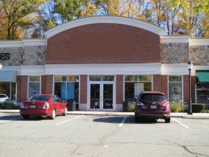

What does it say about a retailer when the most visible storefront window in the shopping center where they reside is a vacancy for rent by the landlord. I have blocked out the signs for these retailers and put them up in a gallery so as to show how the storefronts compare. The only one that stands up to scrutiny from the parking lot consists of a completely opaque low gloss advertisement installed to attract a new tenant. So does this mean that the retailers should start blocking out their storefronts with similar messages? Of course not. It does though show how an opaque, colorful and matte finish storefront graphic is highly visible from a distance and therefore should be added to the retailers bag of storefront display tricks. Check out how Pier One used it in the photos below. And just for fun, see if you can guess who the retailers are without the sign? Managing such a challenge is and indication of a successful storefront.
Visual Holiday Cheers!
It is probably obvious to anyone following this website that I am after a formula for the perfect daytime storefront. The challenge is how to make the window display standout against all the visual noise in the environment. Whenever, in my travels, I see a candidate for analysis I snap a photo. There is a thing or two to learn from this drugstore in Vienna. First, as noted on previous occasions, bold white graphics applied on the glass work in daylight because they are, by contrast, lighter than everything else in the visual field. Here they both frame the window and define the main sign. Second, in order for an object in the window to compete with the dynamic visual motion created by the varying light levels, shadows and reflections on the storefront it must be the one thing that these are not; i.e., a really bright color as in the bright Christmas tree decorations shown. Third, there must be enough of this color and at a large enough scale for it to be visible from at least 10 ft and probably 20 ft away.

