WELCOME TO
INSIGHTS: A DISCUSSION ABOUT “PUBLIC SPACE” DESIGN
Gaddis Architect specializes in all phases of commercial and commercial retail design, design management and construction. If maximizing the success of your business by optimizing the performance of your store, or commercial space design is a goal, then attending the following “Insights” could provide some very real benefits. Many common, and some not so common, design challenges are analyzed. Solutions aimed at increasing retail traffic, creating visual presence in various environments, and expressing not only a particular shopping experience but also the business’s brand, are presented. We think that all design is, on some level at least, retail design. Please scroll on, start a dialogue, contact us anytime.
Advanced Visual Cognition
Crossing Over the Line of Confusion
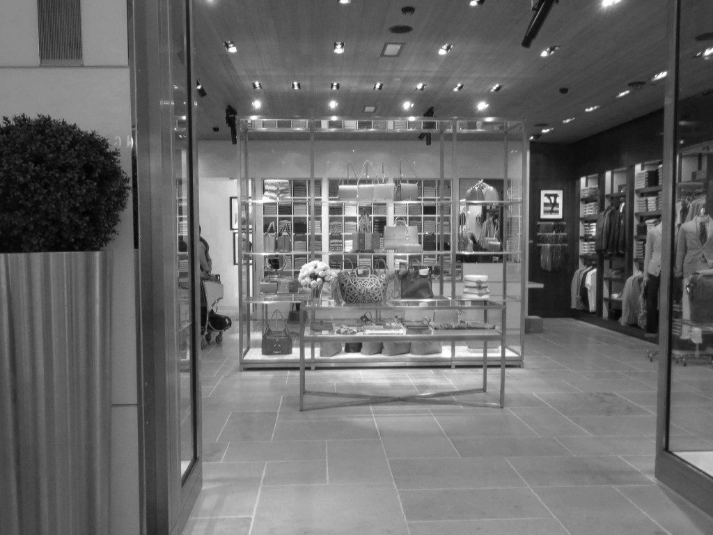
This is an instructive exercise on two levels. First lets consider the impact of merchandise placement in the black and white photo. It is quickly apparent that the main show, directly in the line of view as a customer enters or passes by the store, is an indecipherable patch work which says little about the products being sold. Also, there is actually some secondary “visual cognition”going on as our eye looks for clarity and finds it in the higher contrast which appears on the side walls where individual items or groups of items have been carefully framed by the surrounding architecture. This can be an effective technique when used in the right location; nevertheless assigning center stage to a confusion of merchandise is risky and could easily send customers searching for more understandable views in an adjacent store.
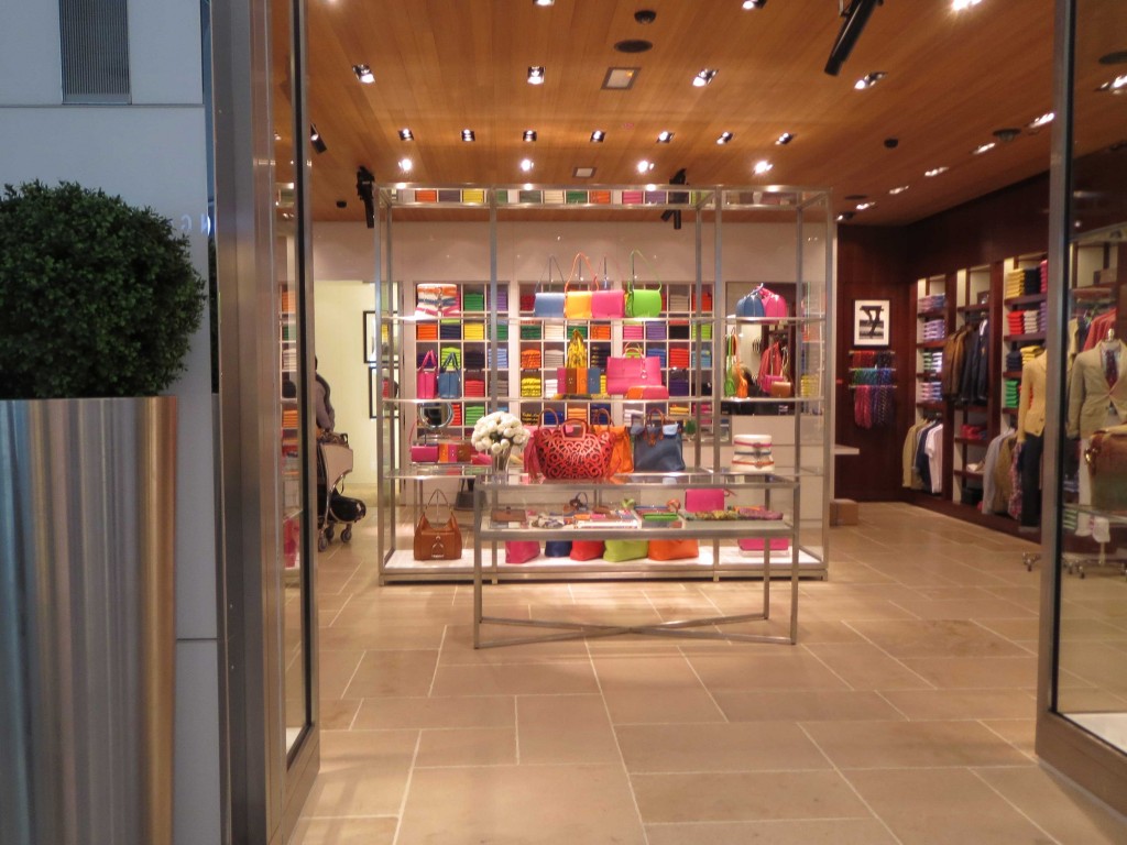
There is more to this particular story though as the second lesson is about what happens when highly saturated color is added to the mix. Suddenly what was a wall of confused merchandise becomes a high visibility focal point standing out in and being framed framed by the mid-tone world. Now the wall of merchandise has attracted attention sufficient to cross over the line of confusion and land squarely on the side of interest. Very interesting indeed.
The suggestive power of real display merchandising.
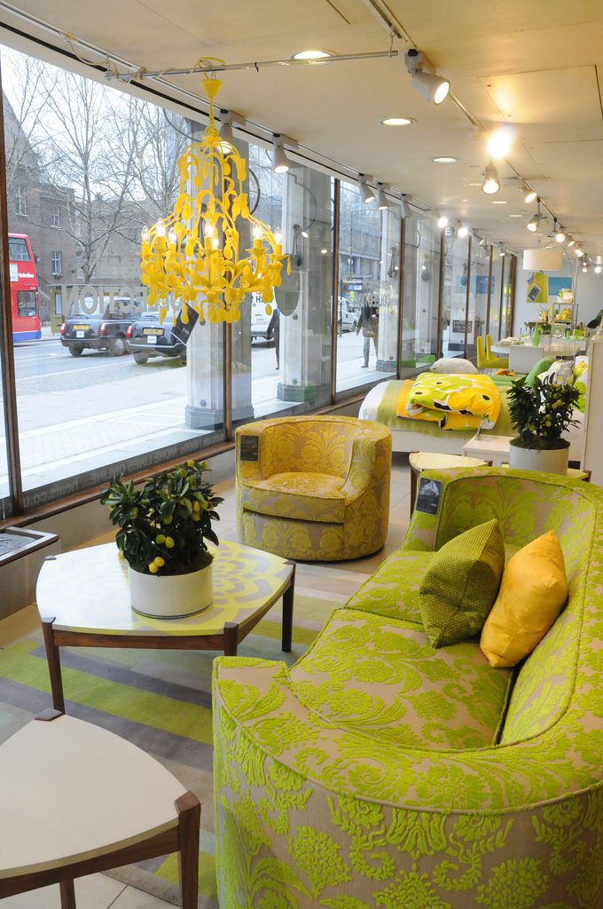
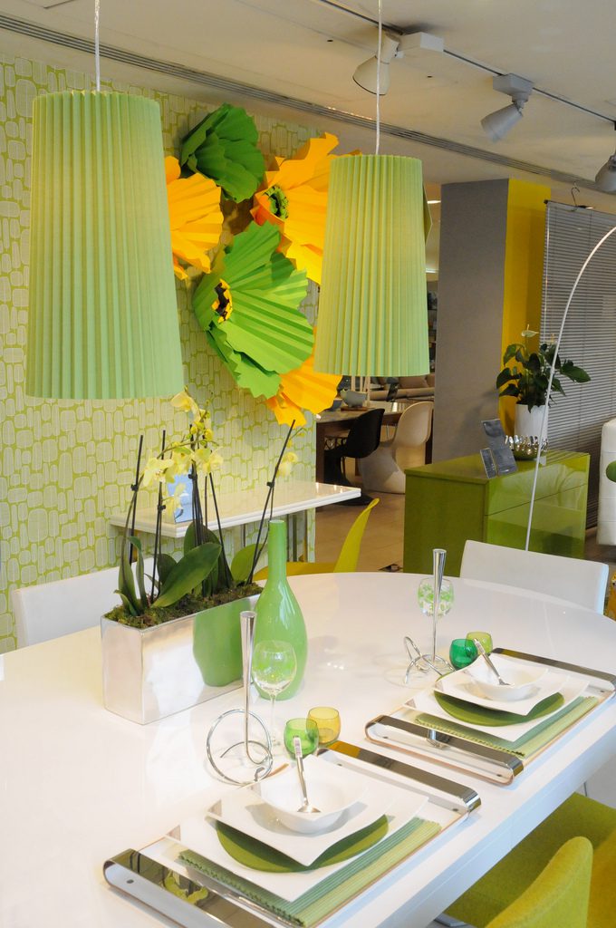
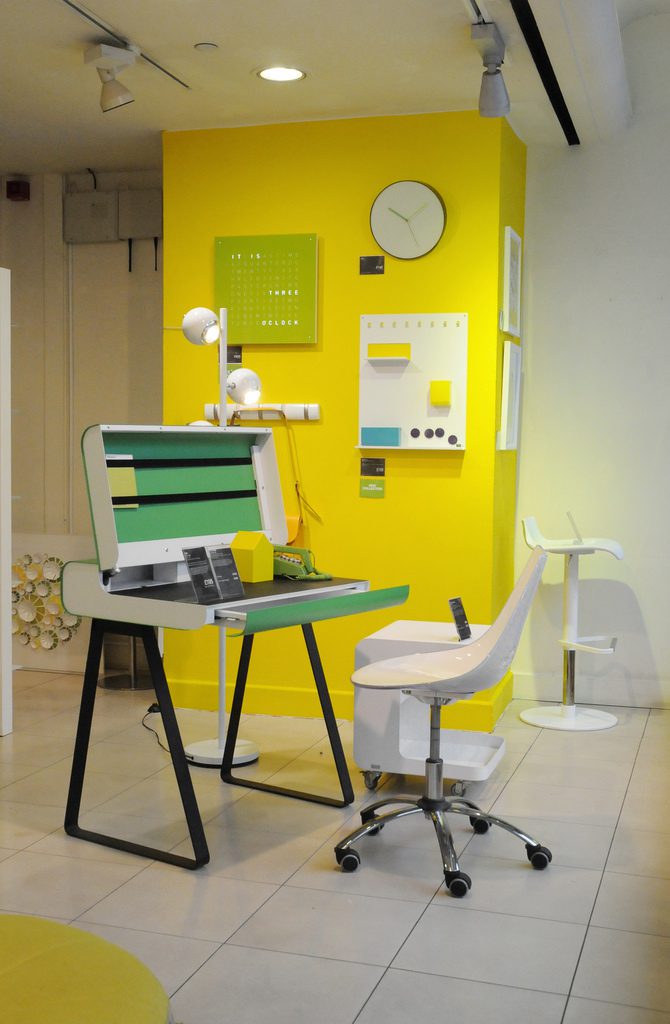
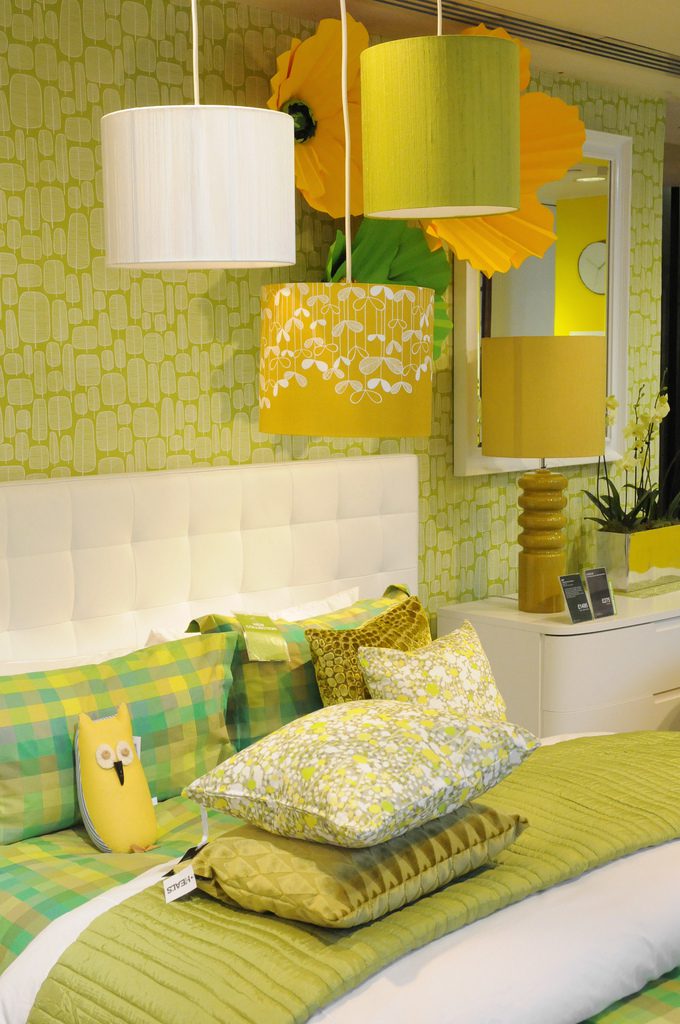
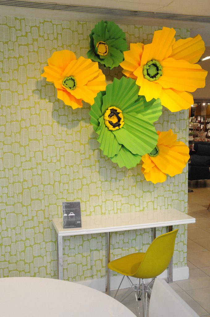
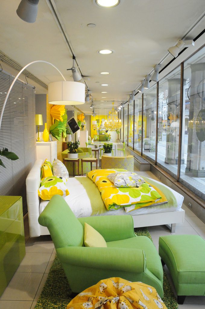
Is it time for a return to old fashioned department store display merchandising? The allure of Heal’s colorful spring program is undeniable, fresh, maybe a new view of bygone expos? The color is expertly used to glue the entire program together so it reads as a single presentation. The green and yellow makes an artful appearance at some point in articles of every scale. It weaves its way through store wide displays, leading the shopper from macro to micro, to more micro images until the shopper finds himself standing in the store.
Have the grey walls of big box stores left us starved for such a visually stimulating shopping experience? Have rows of tiny “New Urbanist” specialty shops, or independent mall store fronts left a patchwork where once there was real visual impact? Have we forgotten about the suggestive power of real display merchandising? Probably.

