
WELCOME TO
INSIGHTS: A DISCUSSION ABOUT “PUBLIC SPACE” DESIGN
Gaddis Architect specializes in all phases of commercial and commercial retail design, design management and construction. If maximizing the success of your business by optimizing the performance of your store, or commercial space design is a goal, then attending the following “Insights” could provide some very real benefits. Many common, and some not so common, design challenges are analyzed. Solutions aimed at increasing retail traffic, creating visual presence in various environments, and expressing not only a particular shopping experience but also the business’s brand, are presented. We think that all design is, on some level at least, retail design. Please scroll on, start a dialogue, contact us anytime.
Double Vision
I have probably posted these notes about daytime storefronts in the wrong order. This post really should have been first because the images provide a visual definition of the main problem a designer faces when dealing with storefront display options at a time of day when the sun is shinning brightly. That would clearly be the tendency of exterior expanses of glass to produce reflections to the extend that we almost always experience at least a double and often a triple, or more, image. Consideration of the shops in the images below proves to be instructive.

Is this a cafe, a bar, a coffee shop? The only thing we know for sure from the street is that it is open, that there is head in street parking in front, a multistory brick building and more street parking across the street. Maybe they do something with hunting because there is a poster or other image of a deer in the window. The things we actually know about the place are mostly defined by the architecture. Wainscoting and historic columns are often seen in restaurants so we naturally make the connection to food. Further, there is a strange cafe curtain in the window, think bakery, as well as what appears to be printed blackboards, both also, associated with food. Otherwise we are in the dark, or in this case reflected light.

The only element strong enough to be seen in this daytime window are the interior lights. Because the merchandise had been placed so close to the interior glass we do understand that they must be selling some type of magazines or printed material, but the actual images are distorted by the reflected scene and clarity is impossible.
Bright is Basic
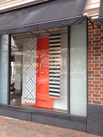
Speaking of the perfect daytime storefront, this photo, actually taken with a smart phone by one of my clients, could not be more instructive. Daytime storefronts almost always have a double image and often a triple or more. Here there is a perfect picture of the surrounding area reflected with varying degrees of clarity on the storefront glass, and amplified by the fact that retailers keep their windows clean. The row houses across the street and classical entry to the building on the corner are reflected perfectly on the glass. Add the images of a passing car and bus, with pedestrians and trees in the street scape, and the entire reflected scene, freeze framed in the photo, becomes animated in real life. How does a retailer make the passerby look past the action on the glass long enough to see what is in the shop window? One way is to somehow force the storefront into shadow, providing of course there is something that is decidedly not shadow in the window. Observe how the banners become a simple colorful graphic on the top half to the photo where the window is in shadow from the awning. Impractical as this is, it does point to the often written about here, bright colored high contrast graphic as an effective solution. Landscape artists know that distant images in their paintings appear less saturated in color and lower in contrast than those close up in the scene. It is an observation taken from real life visual perception. We see detail by dint of contrast and color on that which is close. Exaggerating this concept can be a useful way of attracting visual attention. To the passerby very high contrast, colorful and larger than life images jump out of the normal field of vision. They attract attention, a basic function of the successful storefront.
More Right than Wrong


Don’t be fooled by the dirty outdated canopy, fluorescent lighting, bad or non existent signage, and muralstone finish. This is a very effective storefront and I bet the shop owner is not, even a little, interested in an update. I was across and down the street trying to get a good night time view of the place, when a middle aged guy passed. Realizing what I was doing he began to tease and pretend to wear a wig. It was a telling test of the shop window. Even from some 75 feet away a slightly tipsy guy could easily see that the shop was selling wigs.
What makes this work?
- The window is full, from top to bottom, with product.
- The size and shape of the product is literally human in scale and therefore recognizable.
- Repetition reinforces the single product presentation.
- The angled plan of the window increases the width of the storefront (by the difference between the height plus the width minus the hypotenuse of the triangle), a really efficient way to increase visibility.
- The angle also presents a straight on elevation of product to both pedestrian and auto traffic.
- There is light directly on the merchandise.
- The overall presentation is so strong that on a secondary level it begins to suggest a brand, i.e. “that place with all the wigs.”