<
►
>
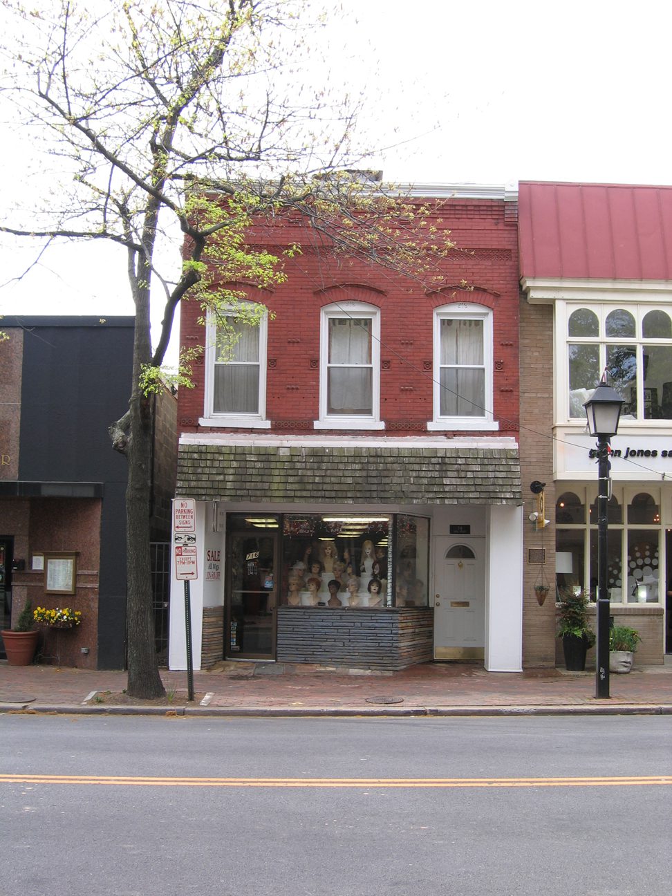
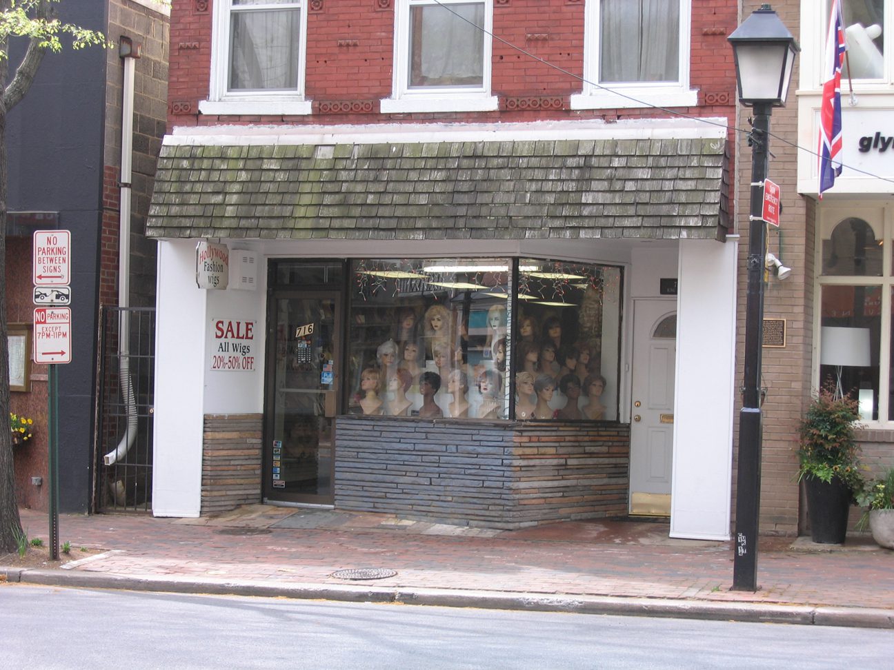
Daytime View of Storefront
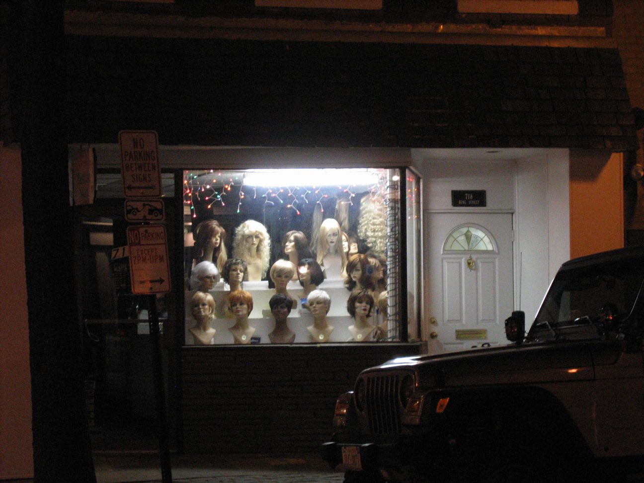
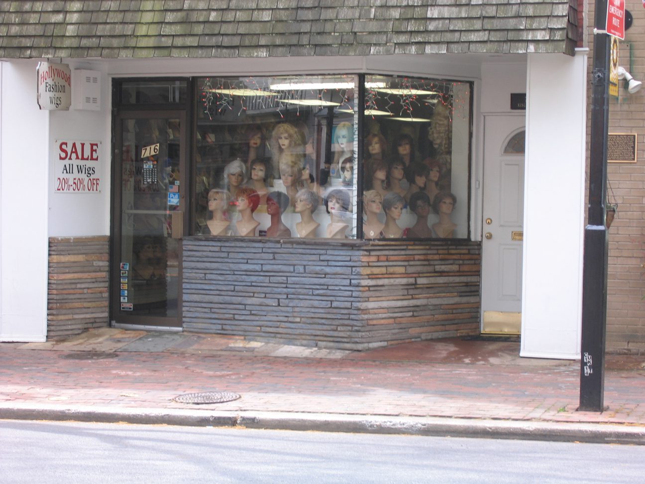
Don’t be fooled by the dirty outdated canopy, fluorescent lighting, bad or non existent signage, and muralstone finish. This is a very effective storefront and I bet the shop owner is not, even a little, interested in an update. I was across and down the street trying to get a good night time view of the place, when a middle aged guy passed. Realizing what I was doing he began to tease and pretend to wear a wig. It was a telling test of the shop window. Even from some 75 feet away a slightly tipsy guy could easily see that the shop was selling wigs.
What makes this work?
- The window is full, from top to bottom, with product.
- The size and shape of the product is literally human in scale and therefore recognizable.
- Repetition reinforces the single product presentation.
- The angled plan of the window increases the width of the storefront (by the difference between the height plus the width minus the hypotenuse of the triangle), a really efficient way to increase visibility.
- The angle also presents a straight on elevation of product to both pedestrian and auto traffic.
- There is light directly on the merchandise.
- The overall presentation is so strong that on a secondary level it begins to suggest a brand, i.e. “that place with all the wigs.”


