Anyone who has ever seriously tried to design a logo for their business can tell you that it is not so easy, even for graphic designers who specialize in all things related to visual imaging. Certainly, any serious investigation will lead one to the subject of Semiotics, which might be defined as how meaning is created and communicated, or more simply the study of linguistic and non- linguistic signs. Without getting too technical, for this is a specialized academic discipline, it is worth noting that signs fall into three categories:
Icons which are images of a thing itself, as in a picture of a dog and a real dog, or a map of a river and the actual river.
Indexes which are relational where objects affect the sign, like fire (object) creates smoke (sign).
Symbols which have neither similarities in appearance nor causal links, but are rather linked by conventional or cultural knowledge. In short the meaning can be quite arbitrary and is simply known, as in the group of letters that mean bus and an actual bus.
When considered in light of concerns about marketing and branding, ever present in the minds of most retailers, it is instructive to draw some parallels. First though, it is worth examining the terms which have been nicely summarized by Jacob Cass, graphic designer and author. He tells us a brand is “the perceived emotional corporate image as a whole;” an identity “is the visual aspects that form part of the overall brand;” and a logo “identifies a business in its simplest form via the use of a mark or icon. Knowing this, it is not difficult to understand the brand as the idea of a business. It is the semiotic meaning, or sign, expressed by the use of the icons, indexes, and symbols, all of which are visual or have a visual component, leading us to examine the visual image, AKA store design.
Visual Image
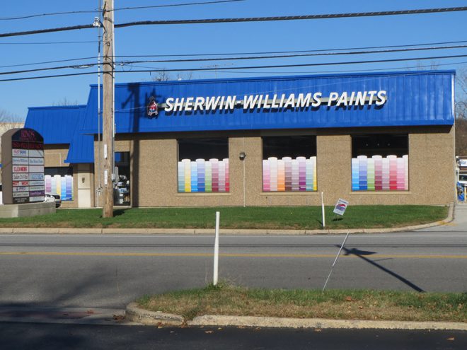
I am bringing this up because I think that architecture is semiotic, and more specifically, retail store design, which might be thought of and applied like a language. One that everyone can read. The Sherwin Williams Paint Store in the photo provides a clearly defined demonstration of these principles, and I must say that I spotted it at 50 MPH while rushing to an unrelated event in a Pennsylvania college town. The impact was direct, and completely comprehensible. I was late to my appointment because I turned the car around to get the photo. The symbol, of course, is the Sherwin William sign on the building. No doubt about who they are and what they are selling.
The logo, not very big, relatively speaking, is both icon and index. When considered in the light of what we now know about semiotics it is complicated and communicates a lot of meaning using symbols in the form of company name and tag line; iconic images of the product, container, location; and an index demonstrating the application. It becomes a statement that says Sherwin Williams paints the world.
The “pièce de résistance” of the entire composition, though, and a big part of the reason I stopped, is the larger than life paint sample cards installed as graphics in all of the storefront windows. According to our labels these probably qualify as icons but are also undeniably symbolic of everything we know about decorating and painting.
There is absolutely no question about the marketing message delivered by this storefront design, but there is another tactic operating here which has less to do with semiotics than it does with tried and true principals of good storefront design. It is what pushes this design into the stratosphere of marketing message delivery, and defines the point where graphics leave off and architecture begins. There is a basic rule that says, if you want a display element to be visible from a distance to both walk and drive by traffic, then it must be exaggerated. It must be bigger, brighter, more colorful than its surrounding. In this case the larger than life paint sample cards are the agent of a cohesive marketing message. The effect is magical.