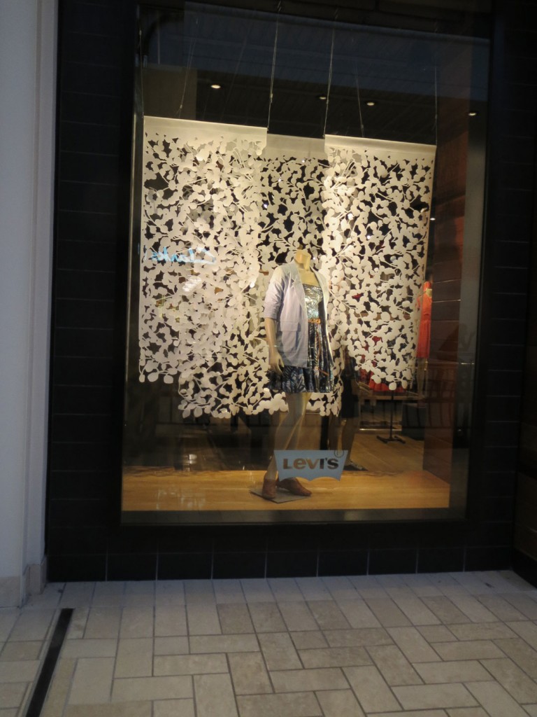
Blossoming Backdrop
I am always surprised when companies with large store planning and marketing resources, not to mention budgets, create and then miss visual display opportunities. It is hardly necessary to comment on the problem here. Any student of this blog can see that the white cut work backdrop forms a high contrast and visually compelling pattern against the black storefront surround and dark interior. It had my attention from across the mall, leading me closer, to be captivated by the interesting pattern. I actually found my self trying to see, snow flakes, flowers, even lace.
So the real question is what did I not see. Of course the main event absolutely disappears. The fix here is too easy to be missed. Just imagine what a great display this would have been had the mannequin been dressed in bold color blocked garments. I almost went in the store to see if they had a suggestion box. Also, on a more serious business note, this is some very expensive real estate. To expensive to be donated as a public service gallery when it should be selling a product.
I see and additional flaw in this display, which may be personal preference and pales in comparison to the aforementioned larger issue, but is, nevertheless, worth a mention here. I have a problem with headless mannequins in storefront displays. I find them unnatural and too cheap for all but limited use.
